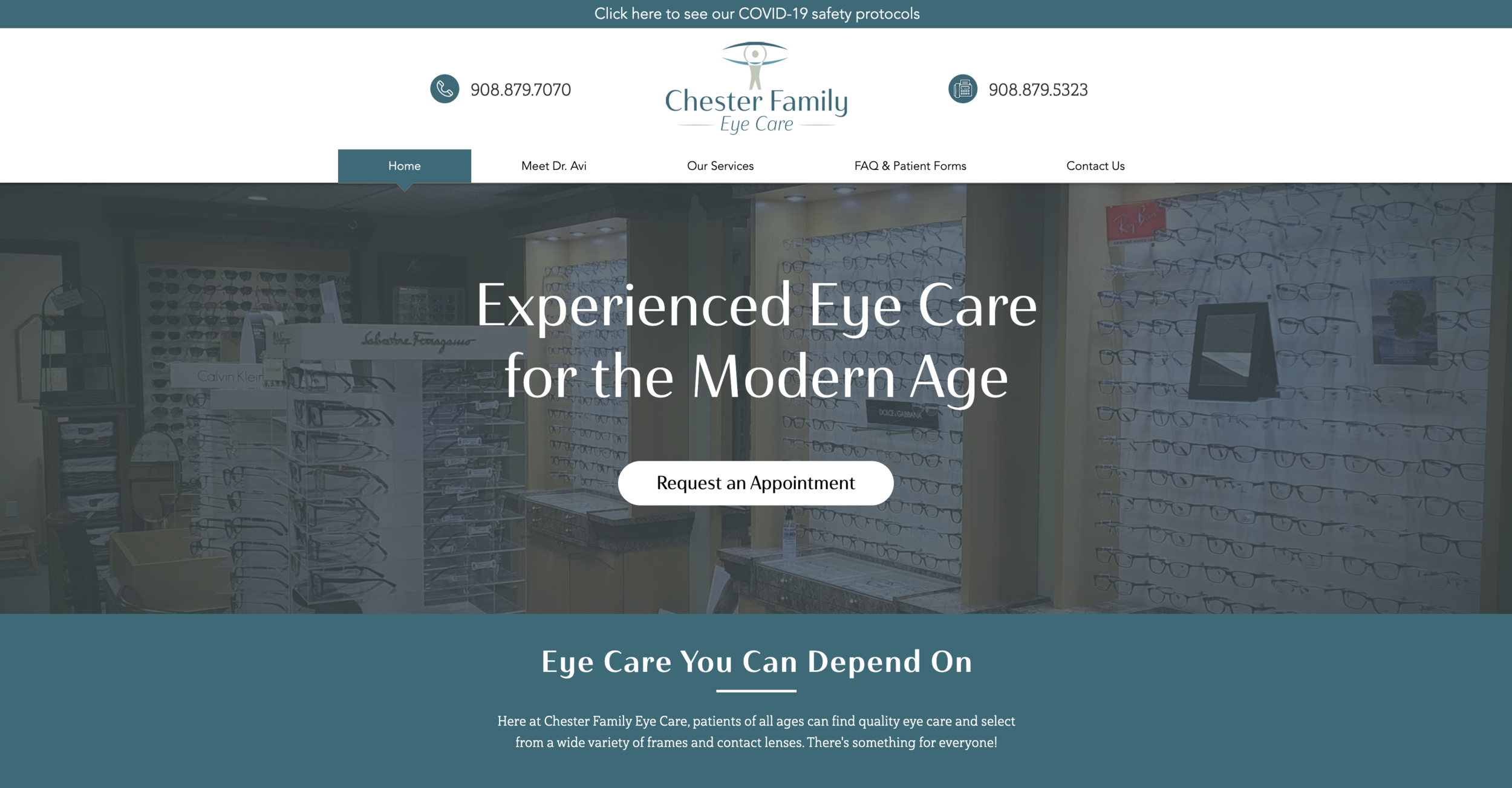
Chester Family Eye Care
Full branding project for Chester, NJ based optometry practice
Logo and Branding
When brainstorming and sketching ideas for the logo I wanted to convey the feelings of family-friendly, local, professional, and caring. The logo represents these feelings through soft cool colors, a friendly sans-serif typeface (Haboro Contrast), and a character that “holds” eye care up to high standards. These same elements are the main pillars of the brand.


